Stack Overflow: answer sources by the numbers
March 09, 2015 by Marco Cecconi
March 09, 2015 by Marco Cecconi
I spent the past few weeks taking an in-depth look at how our users find questions to answer, with a keen eye on Stack Overflow. I measured user behavior and click streams and discussed with the other Stack Overflow developers and community managers how they meant the navigation and questiion list pages to work when they implemented them.
Last week I blogged about the answer sources. This posts deal with the measured user behavior. Where do our users actually find stuff to answer? What do the numbers say?
I think I found some interesting answers.
It's not trivial to understand how our users find stuff to answer because the site is so varied and functionality-rich. Since question sources lead to questions and question pages contain the form used to answer, we've been injecting hidden <input> fields containing the source in the form using a mix of the referrer and server-side logic. We then store the events in our A/B and site measuring internal über-tool PRIZM.
I then proceeded to apply some convoluted SQL to investigate the question "where do Stack Exchange answers come from?"
The first thing we looked at is the breakdown by page.
This breakdown shows that most answers come from either the home page or the "Questions by Tag" page. This is hardly surprising as they are some of the most easily reachable pages (by clicking our logo or clicking on a tag).
Another interesting breakdown is answers by tab.
The "Newest" tabs are by far the most used sources -- people monitor tags by sitting on the tabs displaying incoming questions to answer as fast as possible. Also, the interesting tab on the home page seems to be a good source of answers.
The next thing we examined is what sources lead to more reputation gain. For this we use a fake "rep" value calculated via rep (score * 10 + 15 if accepted), which doesn't really account for down votes and bounties. Joined with the number of answers give, this shows that, by far, the tabs with most velocity are favored.
A common doubt is that the number of views affects score and thus the views that show lists having questions with the most traffic will generate more rep due to it, instead of the quality of their contents. I verified that there is no major change on the question voting patterns until 250 views. I have already corrected all the statistics, including past ones, you will find here so only questions with at most 250 views are considered.
Instead, consider the questions with 700-800 views: more than 60% of them have scores below -1 or over 7! Whilst quality drives views, there's no doubt that views drive voting. By considering only questions with relative few views, we are removing outliers from our data and increasing its quality. How many answers are we disregarding with this? In percentage, few. See how answers are distributed in the buckets.
Another doubt is that users with higher reputation gain more votes than users with less. This is a reasonable question because the more a user is experienced, the more effective they become at answering -- they've had time to learn. To remove any doubt, we've been only considering answers to recent questions (answer within 12 hours), and only recent activity.
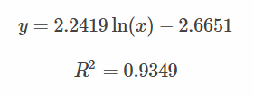
Surprisingly, this scatter diagram follows a log law with a decent fit:

This shows that different reputation groups have different reputation gains from answers -- because of experience, because of self-selection, because people vote more for higher rep users, and so on -- and that these gains are predictable. We can use it to create reputation "boundaries" to cluster users into sensible groups arbitrarily. We can then use those groups to see if there are differences in behaviors.
| Group | Total Rep | Average "Rep" | # Users |
|---|---|---|---|
| Minimum | 1 | 1.705339066 | 2416047 |
| Low | 2-200 | 7.94400314 | 1357252 |
| Medium | 201-2500 | 12.33444211 | 186998 |
| High | 2501-30000 | 17.76094111 | 30219 |
| AAA+++ | 30001+ | 25.33123327 | 1718 |
As you can see the users have different average "Reputation" gained by answering (so, likely, different behavior). As the whole community breaks down in these categories, predictably the numbers go down as the rep goes up, but the number of users is still high so the category is useful.
There are some evident patterns in this graph:
These are the key takeaway points:
Discuss on Reddit or Hacker News
Hi, I'm Marco Cecconi. I am the founder of Positron Lans, developer, hacker, blogger, conference lecturer. Bio: ex Stack Overflow core team, ex Toptal, ex BaxEnergy.
Read moreMarch 31, 2026 by Marco Cecconi
Positron Flux is a new a delivery excellence workbench
Read moreFebruary 20, 2026 by Marco Cecconi
Last night I decided to dedicate some time to my old [z80 emulator](https://sklivvz.com/posts/z80). I've squashed a few bugs and ported it to .NET 10. Then I added a ULA emulator.
Read moreFebruary 08, 2026 by Marco Cecconi
Compile-time translations via source generators, ICU MessageFormat + CLDR plurals, PO file workflows, no per-request allocations.
Read moreDecember 27, 2024 by Marco Cecconi
TDD can’t guarantee zero-defects. Let us debunk this software development myth.
Read moreMarch 12, 2023 by Marco Cecconi
Stack Overflow could benefit from adopting a using conversational AI to provide specific answers
Read more$ wget -O - hackurls.com/ascii | less
Read more…